Living Room Color Ideas: 12 Palettes Designers Love
12 living room color ideas that work in real homes — from warm whites to moody jewel tones. See each palette applied to an actual room with AI.
Ryan H.
Founder of Remodel AI · March 29, 2026 · 11 min read
Picking a living room color is one of those decisions that feels way more stressful than it should be. You stare at 47 paint swatches that all look identical under store lighting, bring three home, tape them to the wall, and still can't decide. Then you pick one, paint a whole room, and realize it looks completely different at 7 PM under your actual lamps.
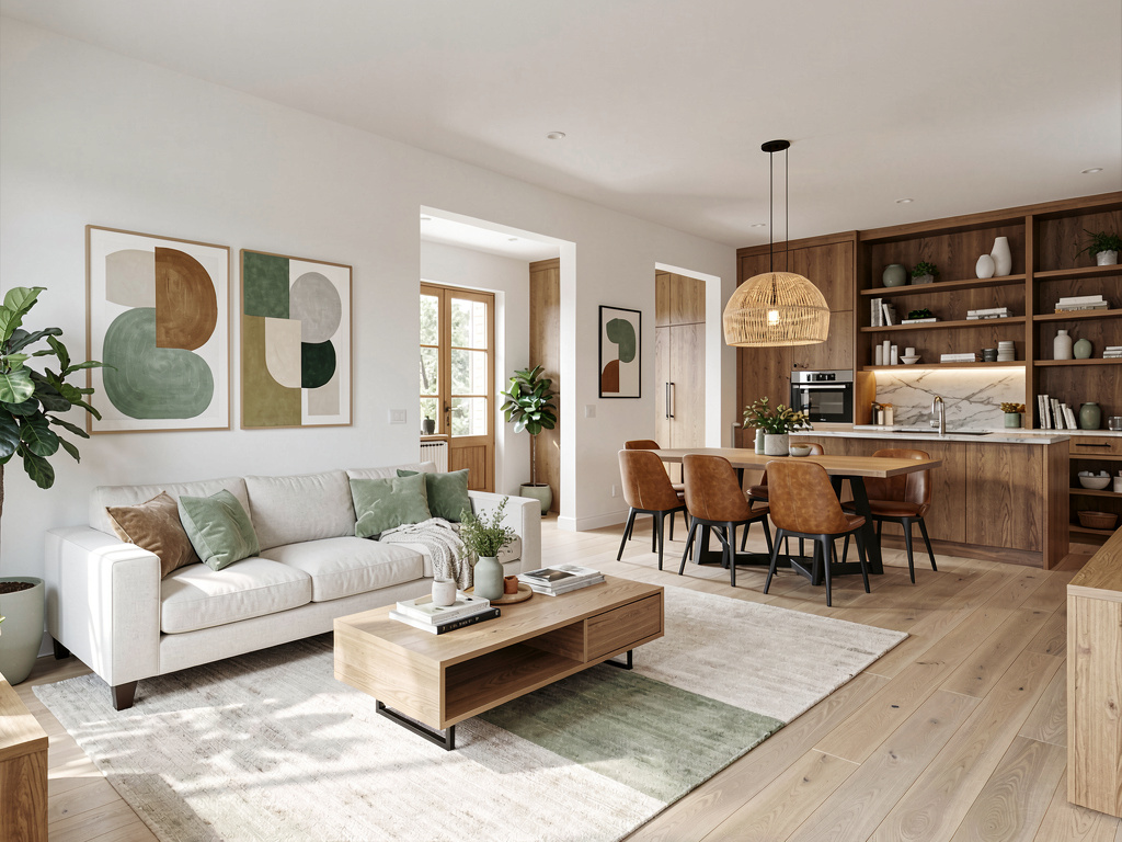
The problem isn't that you have bad taste. It's that color doesn't exist in isolation. A paint color changes depending on the furniture, the flooring, the light direction, and the other colors next to it. That's why the best living room color ideas aren't single paint colors — they're complete palettes where every element works together.
Here are 12 living room color palettes that designers keep coming back to, what makes each one work, and what they actually cost to pull off.
1. Warm white and beige
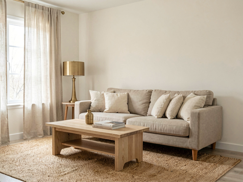
Walls in creamy warm white. A linen sofa in natural oatmeal. A light oak coffee table. Cream throw pillows, a woven jute rug, soft ivory curtains. Everything stays within the warm white-to-beige range, and the room feels calm without being cold.
This is the safest palette on this list, and that's not an insult. Warm white and beige works in every room size, with every light direction, and with almost any furniture you already own. The key to making it feel intentional rather than bland is texture — mix linen, jute, wool, and wood so your eye has something to land on even when the colors are quiet. According to Sherwin-Williams' 2026 color forecast, warm whites with yellow undertones continue to outsell cool whites by nearly 3 to 1.
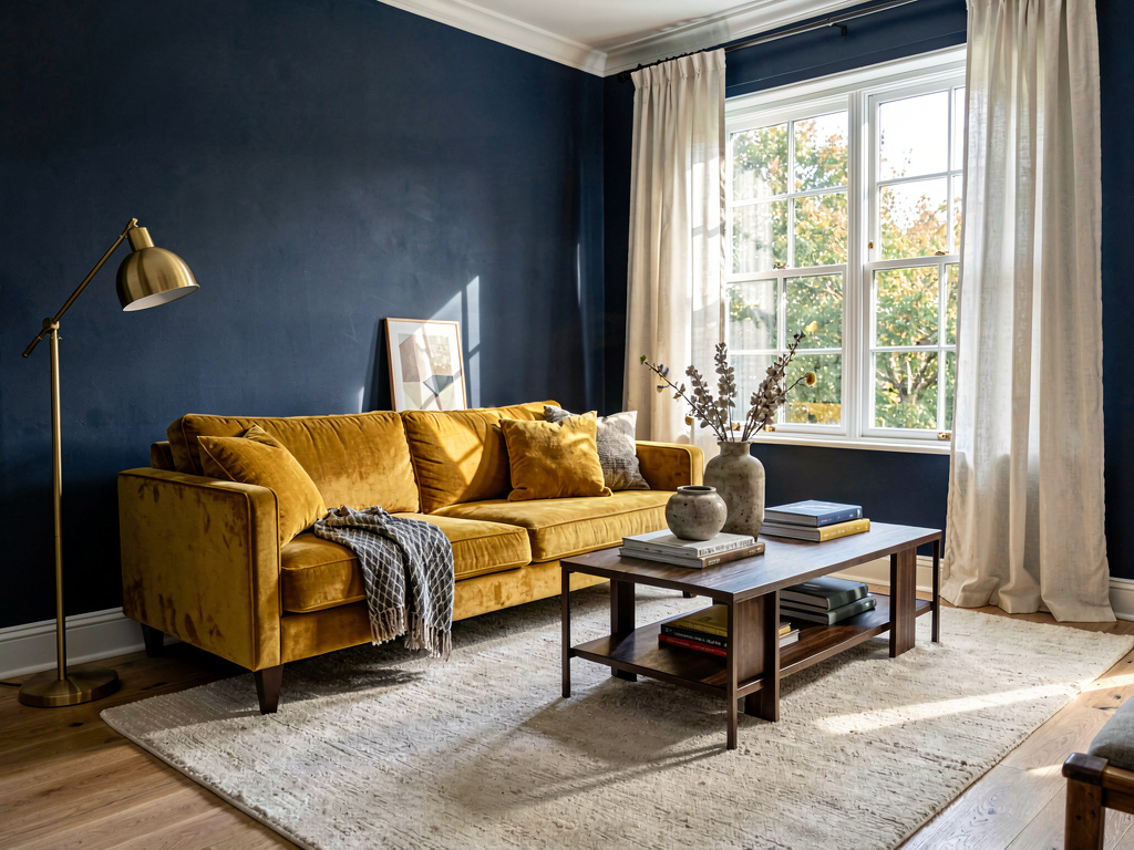
2. Navy blue and gold
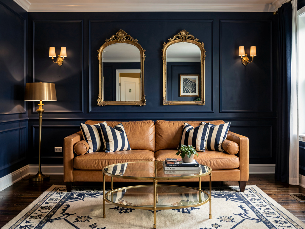
Deep navy paint on every wall. A camel leather sofa. Gold-framed mirrors and a brass-and-glass coffee table. Navy and cream striped pillows. A warm gold floor lamp. Dark hardwood floors with a cream and navy area rug.
Navy is one of the few dark colors that makes a room feel smaller without making it feel cramped. It reads as depth, not confinement. The gold accents bounce warm light around the room and keep it from feeling like a cave. This palette works best in rooms that get good natural light during the day — the navy absorbs a lot of light, so you need it coming in from somewhere. A gallon of Benjamin Moore Hale Navy (HC-154) runs about $45-$80 depending on the finish. For a 12x15 living room, plan on two gallons for full coverage.
3. Sage green and cream
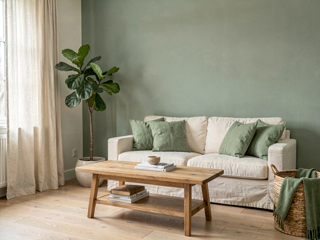
Soft sage green walls. A cream linen sofa with sage throw pillows. A natural wood coffee table. A potted fiddle leaf fig. Cream curtains. Light oak floors. The whole room feels like a breath of fresh air.
Sage green had its breakout moment in 2023 and hasn't faded. It works because green is the easiest color for the human eye to process — it's literally the color we're most sensitive to. Paired with cream and natural wood, it creates a room that feels organic and restful. This is a good palette for north-facing rooms that get cool, indirect light, since sage green leans warm enough to counteract the blue cast. If you've been thinking about cozy living room ideas, sage green and cream delivers that feeling without heavy textiles.
4. Terracotta and rust
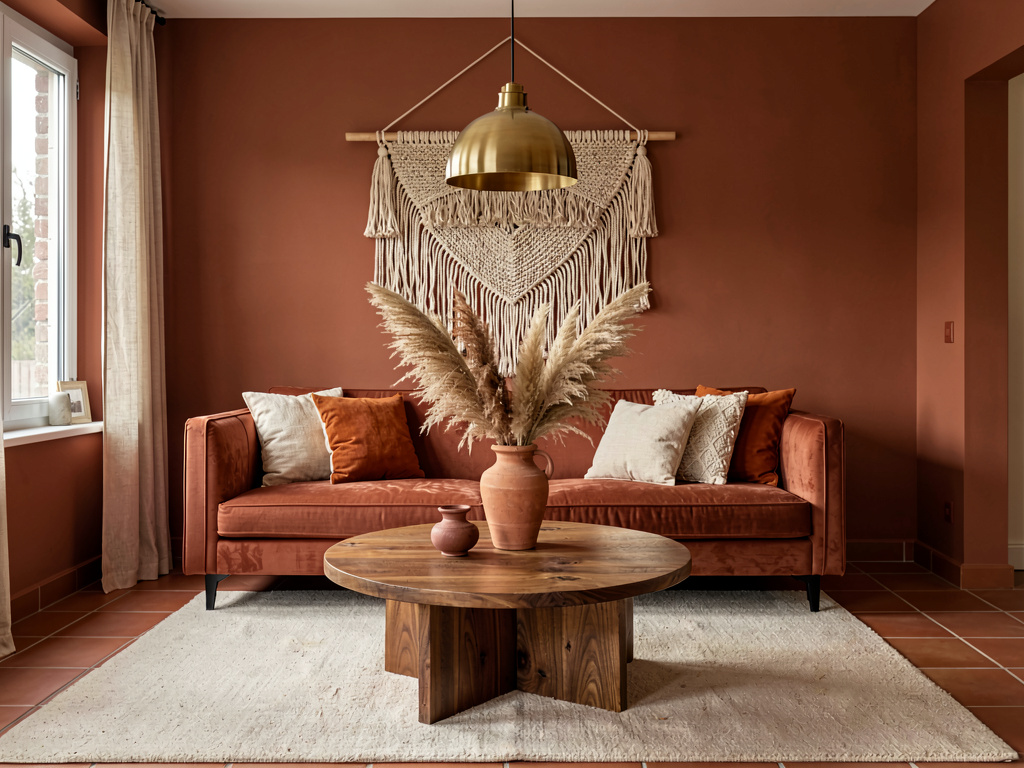
Terracotta walls wrapping the entire room. A rust-colored velvet sofa. A round walnut coffee table. Dried pampas grass in a clay vase. Cream and burnt orange pillows. A woven wall hanging. Warm brass pendant light overhead.
This is a bold palette, and you need to commit to it. One terracotta accent wall with three white walls looks hesitant. All four walls in terracotta with matching warm furniture looks intentional. The room above works because every surface shares the same warm undertone — the walls, the sofa, the wood, the brass. Nothing fights. According to Houzz's 2025 Home Design Trends survey, earth tones are the most popular color family for living rooms, chosen by 34% of homeowners renovating.
Paint cost for this room: $60-$120 for two gallons of quality terracotta (try Sherwin-Williams Cavern Clay SW 7701 or Benjamin Moore Mexicali Rose 1301).
5. Charcoal and blush pink
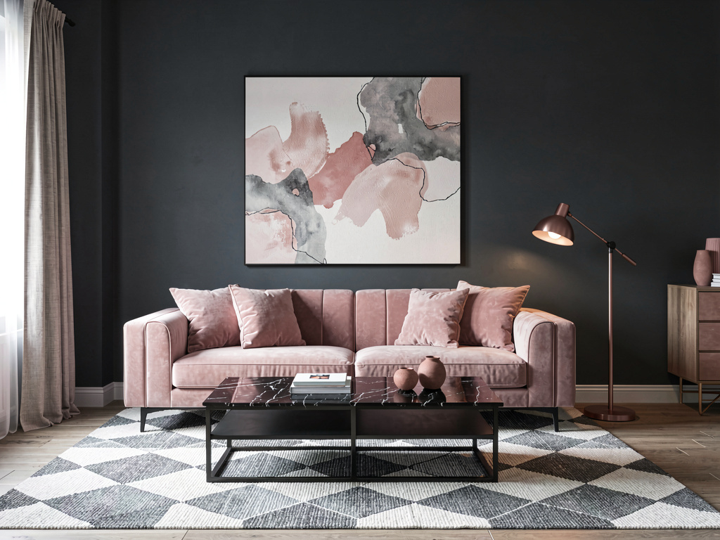
Dark charcoal walls. A blush pink velvet sofa. A black marble coffee table. Rose gold accent lamp. Soft pink throw pillows. A gray and white geometric rug. Abstract art in blush and gray tones on the wall.
This palette surprises people because charcoal and pink sound like they shouldn't work together. But charcoal is a neutral — it's just a deeper version of gray — and blush pink is the softest possible accent against it. The contrast is dramatic without being aggressive. This is a palette that photographs extremely well, which is why you see it constantly on Pinterest and in mid century modern living room inspiration boards. In person, the pink reads warmer and the charcoal reads softer than you'd expect.
6. Olive green and walnut
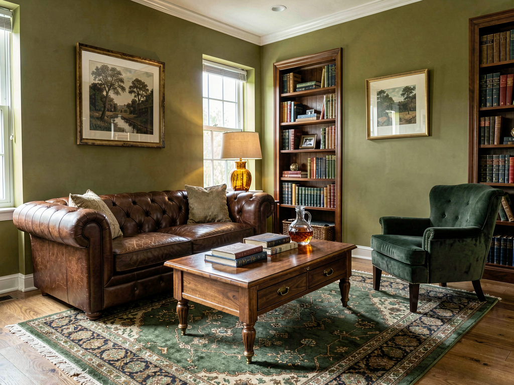
Olive green walls. A deep brown leather chesterfield sofa. A walnut coffee table with brass hardware. A dark green velvet armchair. An amber glass table lamp. Books stacked on the coffee table. A vintage Persian rug in greens and browns.
This is the library palette — rich, warm, and a little moody. It works in rooms where you want the atmosphere to feel quiet and serious. Olive green and walnut brown share the same warm yellow undertone, which is why they feel natural together. The brass and amber glass add just enough warmth to keep the room from feeling dark. This palette is popular in studies and home offices, but it works in living rooms where the primary activity is reading, talking, or watching a fire.
7. All-white with texture
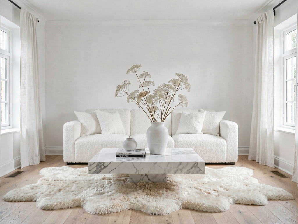
White walls. A white bouclé sofa. A white marble coffee table. A cream sheepskin rug. White linen curtains. Dried white lunaria branches in a ceramic vase. Bleached oak floors.
The all-white living room is either the most serene or the most sterile thing you've ever seen, and the difference is texture. The room above works because every surface is a different material — bouclé, marble, sheepskin, linen, ceramic, oak. Your eye registers variation even when the color is the same. If you go all-white, you need at least five different textures in the room or it will feel like a hospital waiting room. This palette is best for south-facing rooms with strong natural light, where the sun creates natural shadows and warmth across all those white surfaces.
8. Moody jewel tones
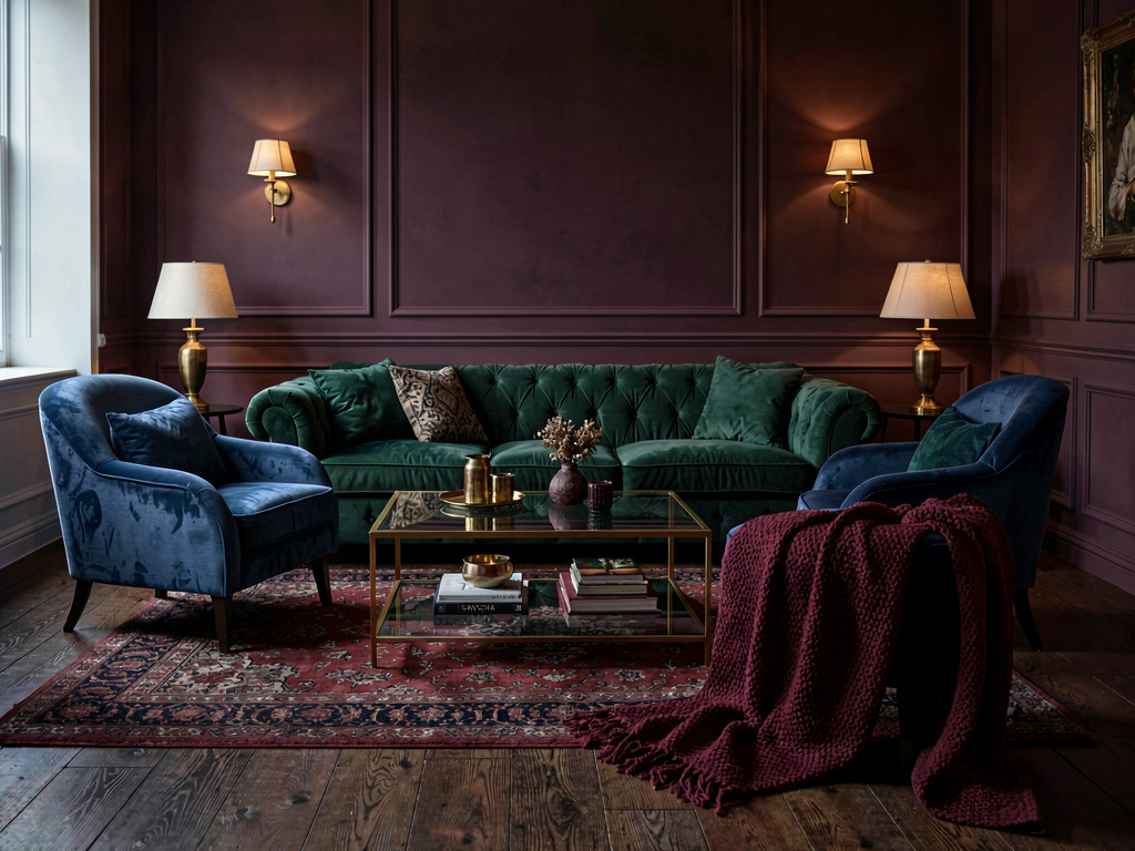
Deep emerald green velvet sofa. Dark plum walls. A sapphire blue armchair. A gold and glass coffee table. A burgundy throw blanket. Brass wall sconces. A deep red and navy Persian rug.
See Your Room Redesigned
Download Remodel AI and transform any room in 30 seconds. 3 free designs, no signup.
This is the maximalist palette, and it takes confidence to pull off. The trick is staying in the same saturation level — all of these colors are equally deep and rich, so nothing pops out as an accident. Jewel tones work especially well in rooms used primarily at night, because they come alive under warm artificial light. According to the National Kitchen and Bath Association, jewel tones in living spaces have grown 28% in popularity since 2023. This is a palette that pairs well with art deco interior design — the richness of the colors matches the opulence of the style.
9. Coastal blue and white
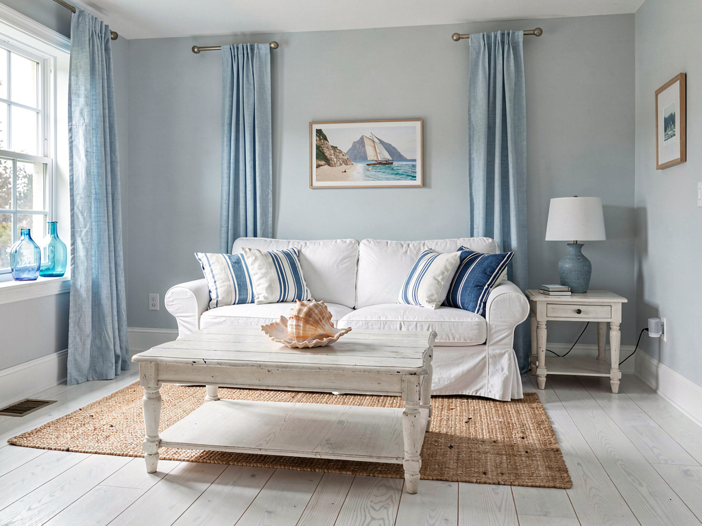
Pale blue-gray walls. A white slipcovered sofa with blue and white striped pillows. A whitewashed wood coffee table. Light blue linen curtains. Wide plank white oak floors. A sisal rug. Blue glass bottles on the windowsill.
Coastal doesn't have to mean seashells and anchors. The best coastal palettes are just blue and white done well — no theme, no kitsch, just color. Blue-gray walls (try Benjamin Moore Quiet Moments 1563 or Farrow & Ball Light Blue No. 22) keep the room from feeling like a beach house rental. The sisal rug and whitewashed wood add warmth without breaking the palette. This is one of the easiest living room color ideas to execute because the two-color constraint makes every decision simpler.
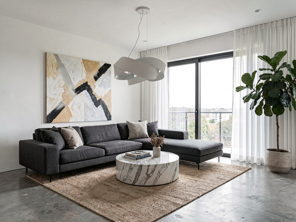
10. Black, white, and natural wood
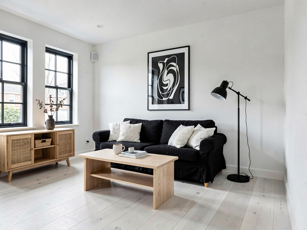
White walls with black window frames. A black linen sofa with white throw pillows. A light ash wood coffee table. Black and white abstract art. A natural wood console table. Black metal floor lamp. White oak floors.
This is the Scandinavian graphic palette — high contrast but softened by natural wood. The wood is doing all the heavy lifting here, preventing the black and white from feeling harsh or clinical. Without it, this room would feel like a chess board. With it, the room feels clean and considered. This palette is forgiving of mess — black and white read as intentional, so even when the coffee table has yesterday's mail on it, the room still looks put-together.
If you're working with a small living room layout, this palette helps because the white walls expand the space while the black elements create depth.
11. Caramel and cream
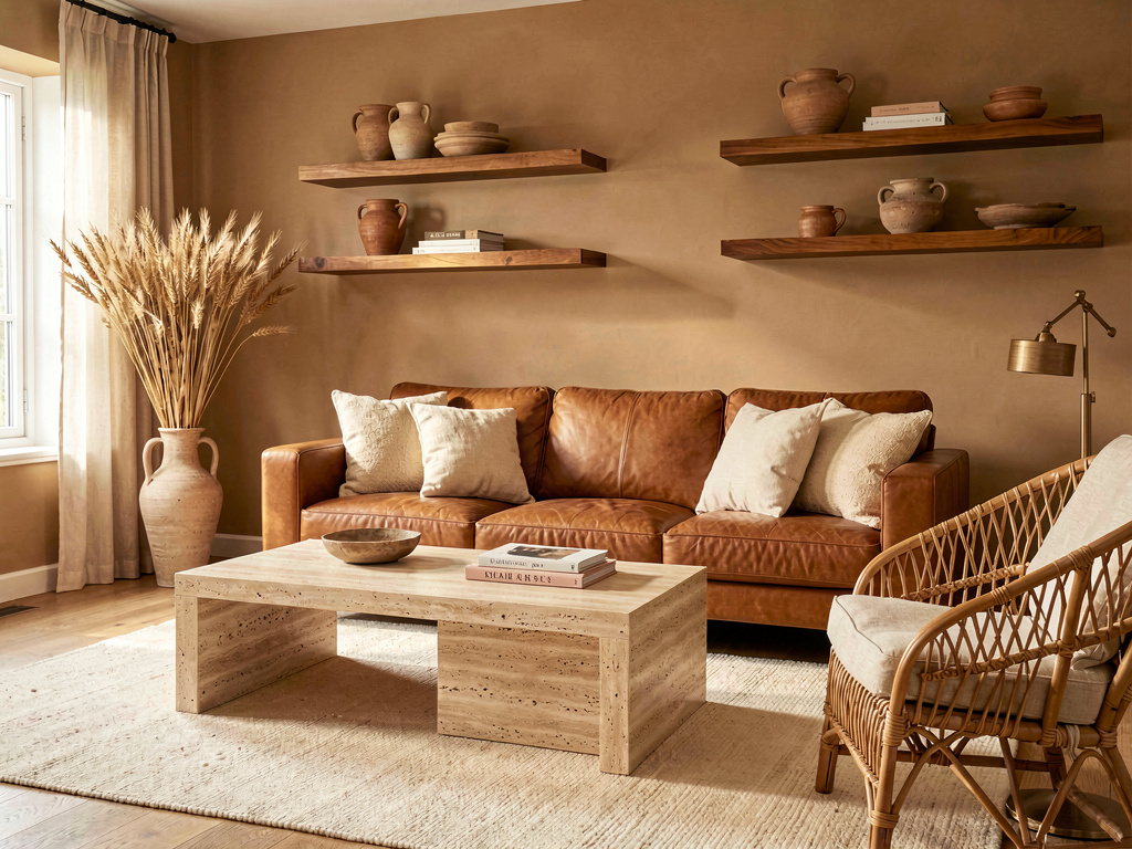
A caramel brown leather sofa with cream throw pillows. A travertine coffee table. Warm sand-colored walls. A cream wool rug. A rattan accent chair. Dried wheat stems in a ceramic vase. Warm wood floating shelves.
This is the modern take on the modern farmhouse interior palette — same warm tones, but cleaner lines and more restraint. Caramel leather develops a patina over time that makes it look better with age, which means this room actually improves as you live in it. The travertine coffee table is the quiet star — its natural veining adds visual interest without adding another color. This palette runs $0 if you already have a leather sofa, since the rest is just paint and accessories.
12. Mauve and warm gray
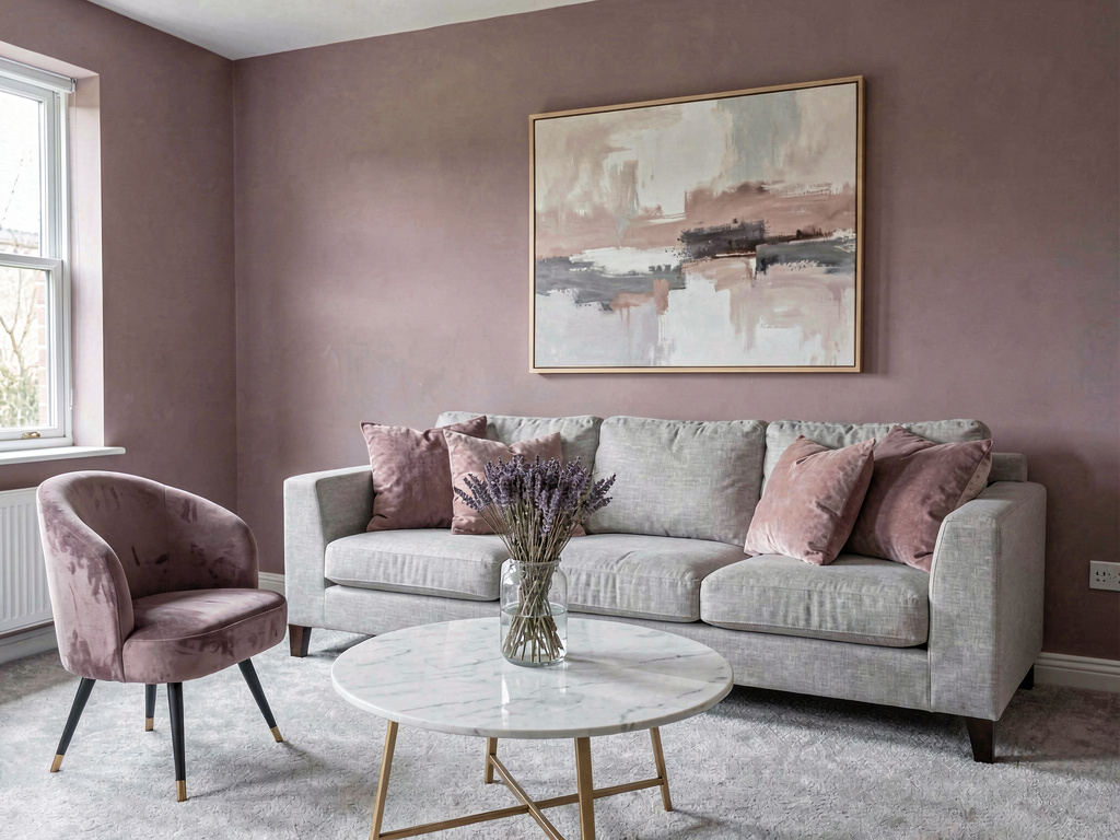
Soft mauve walls. A light gray linen sofa with dusty rose and lavender pillows. A round white marble coffee table. A mauve velvet accent chair. Dried lavender in a glass vase. A blush and gray abstract painting. Light gray carpet.
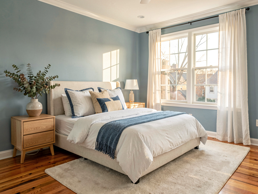
Mauve is gray's warmer cousin — it has enough pink in it to feel warm without reading as pink. Paired with gray, it creates a room that's soft and quiet without being sterile. This is one of those palettes that looks different at every time of day: pinkish in the morning, grayish at noon, almost purple at sunset. It's especially good in bedrooms, but in a living room it creates a space that feels restful. If you like the palette from the master bedroom ideas post, mauve and gray translates well to living spaces too.
How much does it cost to change your living room color palette?
Here's what each element actually runs:
- Paint: $30-$80 per gallon. Most living rooms need 2-3 gallons. Total: $60-$240.
- Throw pillows: $15-$50 each. 4-6 pillows to change the accent color. Total: $60-$300.
- Throw blanket: $30-$80 for a quality one.
- Rug: $100-$500 for an 8x10 area rug depending on material.
- Curtains: $30-$100 per panel. Most windows need two panels. Total: $60-$400.
- Accessories (vases, candles, art): $50-$200 depending on scope.
Full palette change: $300-$1,200 depending on how much you replace. Paint and pillows alone get you 80% of the way there for under $200.
Try before you buy with AI
The hardest part of picking living room colors is that paint samples on the wall don't show you the finished room. You see a 12-inch square of color next to your existing furniture and try to imagine the rest.
AI tools solve this. Upload a photo of your actual living room, pick a color palette or style, and see the full transformation in about 10 seconds. You can test navy walls, sage green walls, all-white — whatever you're considering — before spending $200 on paint. Remodel AI lets you try this for free with your own room photos.
How does the paint color match reality?
The AI-generated preview won't be a perfect Benjamin Moore color match, but it shows you the overall effect — how dark walls change the room's feel, how warm tones interact with your existing floor color, whether a bold accent wall works with your furniture. It's better than paint swatches and cheaper than repainting twice.
Can I test just one wall?
Yes. Most AI room design tools let you describe what you want changed. You can specify "paint only the wall behind the sofa in sage green" and leave everything else untouched. This is especially useful for accent walls where you want to see the contrast before committing.
What if I have an open floor plan?
Color is trickier in open layouts because the living room palette needs to work with the kitchen and dining area too. Upload a wide-angle photo that captures the full space and test palettes across the whole room rather than just one section.
Which living room color has the best resale value?
According to a Zillow analysis of home sale prices, homes with living rooms painted in light warm tones (warm whites, light grays, soft beiges) sell for slightly more than homes with bold colors. That said, the difference is small — $200-$500 on a typical sale. Paint what you like. You can always repaint before selling.
Do dark colors make a room feel smaller?
Not always. Dark colors make walls recede, which can actually make a room feel deeper. The issue is usually light, not size. A dark room with good lighting (multiple lamps, warm bulbs, reflective surfaces) feels cozy. A dark room with one overhead light feels like a basement.
Ready to Try AI Interior Design?
Upload a photo and redesign any room in seconds. 3 free designs, no signup required.